

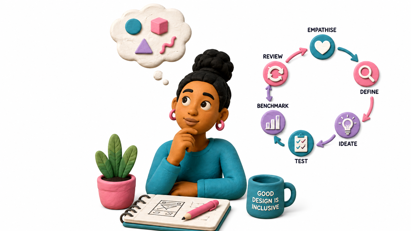
When the Visuals Don’t Pass the Vibe Check. How good intentions, cultural blind spots and two seemingly harmless images revealed why designing for your audience means looking beyond what simply looks good. Category: Design ThinkingMarket: South Africa This case has been anonymised and adapted for educational purposes. Identifying details and commercial details have been changed. 1.The Story: Everything was almost ready. A South African home-services platform was preparing for a wider rollout, with its imagery, platform content and user experience beginning to take shape. The concept was simple: make everyday services easier to find while creating a platform that felt familiar, approachable and representative of the people who would actually use it. Then, during a review, two images stood out. One appeared to represent a domestic worker. However was a shop owner. The other, a gardener. However was a handy man On their own, the images may have seemed harmless, but viewed together, the problem became much harder to ignore. The way the people were portrayed, from their clothing and positioning to the roles they appeared to occupy, created an uncomfortable visual hierarchy. In a South African context, where race, domestic labour and inequality carry a deeply complicated history, the imagery risked evoking something far more troubling than the everyday services it was intended to represent. A brand doesn’t only communicate what it intends to say. It also communicates what people see. And once an image is public, intent doesn’t get to explain it before the audience interprets it. The design challenge therefore wasn’t simply: Should these images be replaced? But: How do you represent real South African workers without accidentally recreating the very stereotypes your attempt at diversity is supposed to challenge? Clock It: Can You Spot the Intentional Stereotyping in the Infographic? 2. The Problem: Wasn’t the Picture. It Was between the lines. Nothing suggested that the imagery had been selected with harmful intent. If anything, the goal appeared to be the opposite: create something warm, relatable and representative of everyday South African life. But good intentions don’t control interpretation. Once a platform reaches people from different racial, cultural, economic and social backgrounds, every visual choice begins communicating something. The risk was therefore bigger than two questionable images. It was about the story those images told when placed within a particular cultural and historical context: Colour tells a story. Language tells a story. Photography tells a story. The people represented tell a story. Sometimes, who isn’t represented tells one too. The story we intended → the story the audience sees → therefore, design thinking starts with people. The question isn’t whether your design is telling a story. It already is. The question is whether it’s telling the story you intended. 3. The Thinking: Design Thinking Starts With People. Design thinking is often associated with wireframes, user journeys and product interfaces, but its role is much broader than how something works or how something looks. At its core, design thinking asks us to understand people before designing for them. What will they notice? What will they feel? What assumptions might they make? What previous experiences will they bring with them? And, importantly, could they interpret what we create differently from the way we intended? Those questions matter because people don’t experience brands through strategy documents. They experience them through a combination of sensory cues, emotions, memories and associations. A customer might see packaging before they understand the product. They might associate a smell with comfort, freshness or quality. Taste can create pleasure and familiarity. Texture can influence whether something feels premium or cheap. Sound can become part of how a product or brand is recognised. The senses collect the signals. The brain decides what those signals mean. And that meaning can influence whether someone feels curious, uncomfortable, reassured, sceptical or ready to buy. That is why design thinking cannot only ask: Does this look good? → It also needs to ask→ What does this communicate? 4. The Perspective: See It Through Someone Else’s Eyes. Instead of asking whether the imagery was attractive or professionally produced, the more important question was: Who might see themselves represented here, and how might that representation feel? Define: Name the Real Problem? The problem wasn’t simply that someone might be offended. That would have been too vague to be useful. The real risk was that imagery intended to communicate diversity and relatability could unintentionally reinforce stereotypes, creating a visual hierarchy that some viewers could associate with servitude, inequality or South Africa’s historical power structures. Once the problem was defined properly, it became much easier to solve. The gardener and domestic-worker imagery demonstrated why this matters, because what may have been intended as an everyday depiction of South African life could be interpreted very differently once race, occupation, power and historical context entered the picture. Ideate → Keep the Intention→ Change the Execution. The objective wasn’t to remove diversity from the platform. It was to represent it better. Alternative visual directions, including illustration and more animated character styles, could preserve the quirky, approachable personality of the platform without relying on literal representations that carried unnecessary cultural baggage. Sometimes the idea is right. The execution needs another thought. 5. The Resolution: One Room. A Million Assumptions. Cultural sensitivity shouldn’t depend entirely on whether someone in the room happens to notice a problem. One person may immediately recognise a stereotype because of their lived experience, while someone from a different background may look at the same image and see nothing unusual. That doesn’t necessarily mean one person is right and the other is wrong. It means they’re looking at the same design through different experiences, histories and cultural reference points. It means they’re looking at the same design through different experiences, histories and cultural reference points. And that is where assumptions begin.The people creating a campaign usually have far more context than the people who will eventually see it. They have seen the brief. They understand the strategy. They know why a particular image was chosen.