

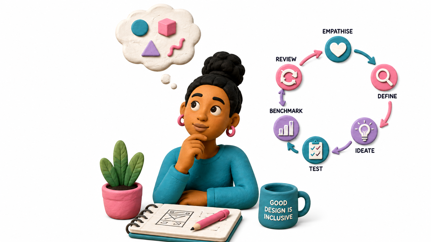
When the Visuals Don't Pass the Vibe Check.
How good intentions, cultural blind spots and two seemingly harmless images revealed why designing for your audience means looking beyond what simply looks good.
Category: Design Thinking
Market: South Africa
This case has been anonymised and adapted for educational purposes. Identifying details and commercial details have been changed.
1.The Story: Everything was almost ready.
A South African home-services platform was preparing for a wider rollout, with its imagery, platform content and user experience beginning to take shape.
The concept was simple: make everyday services easier to find while creating a platform that felt familiar, approachable and representative of the people who would actually use it. Then, during a review, two images stood out.
- One appeared to represent a domestic worker. However was a shop owner.
- The other, a gardener. However was a handy man
On their own, the images may have seemed harmless, but viewed together, the problem became much harder to ignore.
The way the people were portrayed, from their clothing and positioning to the roles they appeared to occupy, created an uncomfortable visual hierarchy. In a South African context, where race, domestic labour and inequality carry a deeply complicated history, the imagery risked evoking something far more troubling than the everyday services it was intended to represent.
A brand doesn't only communicate what it intends to say. It also communicates what people see.
And once an image is public, intent doesn’t get to explain it before the audience interprets it.
The design challenge therefore wasn’t simply: Should these images be replaced?
But: How do you represent real South African workers without accidentally recreating the very stereotypes your attempt at diversity is supposed to challenge?

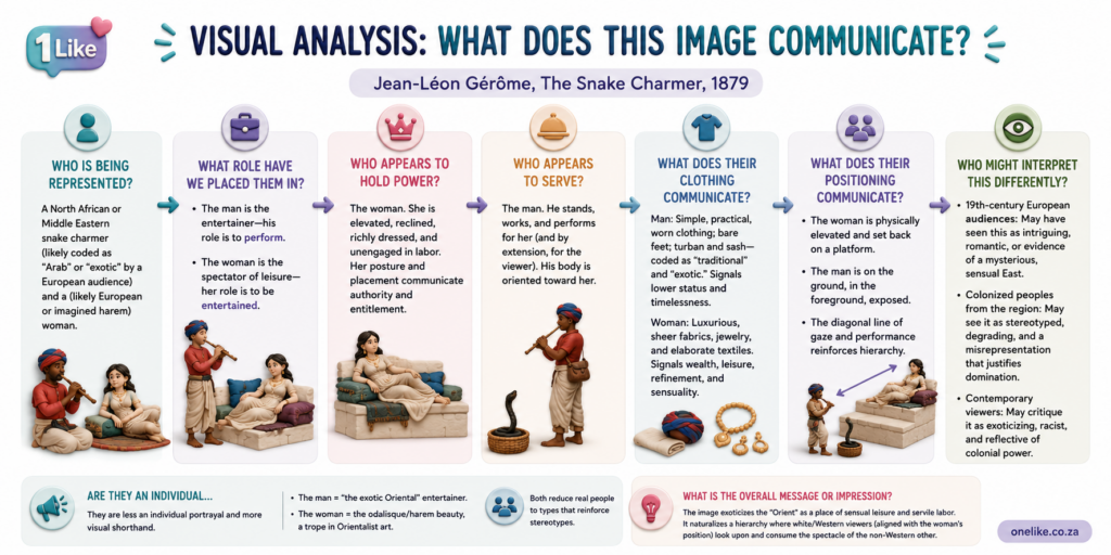
Clock It: Can You Spot the Intentional Stereotyping in the Infographic?
2. The Problem: Wasn't the Picture. It Was between the lines.
Nothing suggested that the imagery had been selected with harmful intent.
If anything, the goal appeared to be the opposite: create something warm, relatable and representative of everyday South African life. But good intentions don’t control interpretation.
Once a platform reaches people from different racial, cultural, economic and social backgrounds, every visual choice begins communicating something. The risk was therefore bigger than two questionable images.
It was about the story those images told when placed within a particular cultural and historical context:
- Colour tells a story.
- Language tells a story.
- Photography tells a story.
- The people represented tell a story.
- Sometimes, who isn't represented tells one too.
The story we intended → the story the audience sees → therefore, design thinking starts with people.
The question isn't whether your design is telling a story. It already is. The question is whether it's telling the story you intended.
3. The Thinking: Design Thinking Starts With People.
Design thinking is often associated with wireframes, user journeys and product interfaces, but its role is much broader than how something works or how something looks.
At its core, design thinking asks us to understand people before designing for them.
- What will they notice?
- What will they feel?
- What assumptions might they make?
- What previous experiences will they bring with them?
- And, importantly, could they interpret what we create differently from the way we intended?
Those questions matter because people don’t experience brands through strategy documents. They experience them through a combination of sensory cues, emotions, memories and associations.
A customer might see packaging before they understand the product. They might associate a smell with comfort, freshness or quality. Taste can create pleasure and familiarity. Texture can influence whether something feels premium or cheap. Sound can become part of how a product or brand is recognised.
The senses collect the signals. The brain decides what those signals mean.
And that meaning can influence whether someone feels curious, uncomfortable, reassured, sceptical or ready to buy. That is why design thinking cannot only ask:
Does this look good? → It also needs to ask→ What does this communicate?

4. The Perspective: See It Through Someone Else's Eyes.
Instead of asking whether the imagery was attractive or professionally produced, the more important question was:
Who might see themselves represented here, and how might that representation feel?
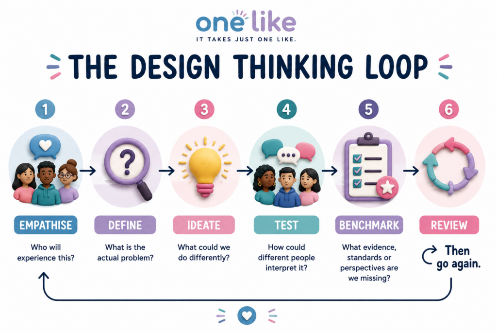
Define: Name the Real Problem?
The problem wasn’t simply that someone might be offended. That would have been too vague to be useful.
The real risk was that imagery intended to communicate diversity and relatability could unintentionally reinforce stereotypes, creating a visual hierarchy that some viewers could associate with servitude, inequality or South Africa’s historical power structures.
Once the problem was defined properly, it became much easier to solve.
The gardener and domestic-worker imagery demonstrated why this matters, because what may have been intended as an everyday depiction of South African life could be interpreted very differently once race, occupation, power and historical context entered the picture.
Ideate → Keep the Intention→ Change the Execution.
The objective wasn’t to remove diversity from the platform.
It was to represent it better. Alternative visual directions, including illustration and more animated character styles, could preserve the quirky, approachable personality of the platform without relying on literal representations that carried unnecessary cultural baggage.
Sometimes the idea is right. The execution needs another thought.
5. The Resolution: One Room. A Million Assumptions.
Cultural sensitivity shouldn’t depend entirely on whether someone in the room happens to notice a problem.
One person may immediately recognise a stereotype because of their lived experience, while someone from a different background may look at the same image and see nothing unusual. That doesn’t necessarily mean one person is right and the other is wrong.
It means they’re looking at the same design through different experiences, histories and cultural reference points.
It means they’re looking at the same design through different experiences, histories and cultural reference points.
And that is where assumptions begin.The people creating a campaign usually have far more context than the people who will eventually see it.
- They have seen the brief.
- They understand the strategy.
- They know why a particular image was chosen.
- What message the campaign is supposed to communicate.
- What the creative team intended.
The customer has none of that..
They don’t know what you meant. They only know what they see, how they interpret it and how it makes them feel.
That is why a room full of intelligent, experienced and well-intentioned people can still approve something that lands very differently once it reaches the public.
The room isn’t the audience! The smaller or more similar the perspectives represented in that room are, the easier it becomes to mistake shared assumptions for universal ones; this is where structured review becomes important.
The customer encounters the finished product without the briefing document attached.
Creative work can be considered against established standards such as the Advertising Regulatory Board’s Code of Advertising Practice, but businesses can also introduce their own inclusion, accessibility and representation checks before creative work reaches the public.
The goal isn’t simply to ask whether something complies with a rule. It is to deliberately challenge the assumptions behind it:
- They have seen the brief.
- They understand the strategy.
- They know why a particular image was chosen.
- What message the campaign is supposed to communicate.
- What the creative team intended.
6. The Result : What Didn't Happen Matters Too.
South African research gives this question particular weight.
A 2025 study by Mavimbela and Radebe-Nkosi examining consumer perspectives on multiracial advertising found that race remains a sensitive subject within the South African advertising environment and argues that marketers need to consider the racial connotations their creative may carry.
The research doesn’t suggest avoiding diversity; quite the opposite.
It recommends multicultural advertising that reflects diverse racial and cultural groups while avoiding stereotyping, misrepresentation, and cultural insensitivity. It stresses the importance of understanding the cultural, social, and historical context of the audiences being represented.
“Customs and sensitivities vary amongst societies.” — Mavimbela & Radebe-Nkosi, Consumers' Perspectives on Multiracial Advertising in a South African Context, 2025
This distinction matters enormously in this case. Neither being a gardener nor being a domestic worker is inherently problematic to represent.
Removing those professions from the imagery because they make us uncomfortable wouldn’t necessarily make the design more inclusive. It could simply create another form of exclusion. The problem is how people are represented.
- A gardener can be represented with dignity.
- A domestic worker can be represented with dignity.
- A cleaner, construction worker, CEO, doctor, delivery driver or receptionist can all appear in inclusive creative.
The question is what happens when race, clothing, body language, positioning, environment and the relationship between the people in an image combine to tell a different story.
The Takeaway!
1. Design for One. Improve It for Many.
Microsoft’s inclusive-design philosophy offers another useful principle: “solve for one, extend to many.”
Its inclusive-design work demonstrates how bringing people with experiences that may otherwise be overlooked directly into the design process can expose friction that designers might not recognise themselves, with improvements potentially benefiting a much wider group.
The principle is useful beyond accessibility. It reminds businesses that the person most likely to identify the blind spot may be precisely the person whose perspective wasn’t represented when the decision was made.
Instead of:
- Instead of: “Do we like this?”
- Ask: “Who are we designing this for?”
- Instead of: “Does everyone in the room understand it?”
- Ask: “Would someone outside this room understand it the same way?”
- Instead of: “Could somebody be offended?”
- Ask: “What specifically could be interpreted differently, by whom, and why?”
Benchmarking isn’t there to make creative work generic or afraid of taking risks.
It is there to make those risks intentional. One room will never contain every perspective. Good design thinking makes sure we don’t pretend that it does.
Representation asks: “Are different people visible?” → Inclusive design goes further: “How are those people being seen?”
Because underneath all that technology is something that hasn’t changed nearly as much:
People want to feel confident before they buy.
That is why lead generation in 2026 isn’t simply a race to generate more traffic, publish more content, or collect more leads. It is about becoming more visible, more relevant, more useful, and more trusted throughout the customer’s decision-making journey.
The businesses that succeed won’t necessarily be the ones generating the most clicks. They’ll be the ones influencing the decisions that matter.
2. How to Execute Design Thinking
Design thinking becomes valuable when it moves from an idea in a meeting to a practical way of making decisions.
Start by looking at the experience from the customer’s perspective. Ask what they see first, what they might feel, what assumptions they could make and whether the message they receive matches the message the brand intended to send.
Then get specific. If something feels wrong, don’t stop at “I don’t like this.” Identify what feels off, why it matters, and what problem it could create for the people experiencing it.
- Is the problem the imagery?
- The language?
- The people represented?
- The cultural context?
- Instead of: “Could somebody be offended?”
- The accessibility of the experience?
Or is there a disconnect between what the brand says it stands for and what the customer actually experiences?
In this case, the concern could be traced to specific imagery and the relationship created between the people represented.
The intention was diversity, warmth and relatability. → The execution risked communicating hierarchy and servitude.
That distinction matters because good design thinking doesn’t necessarily mean starting again. It means understanding where the disconnect happened, preserving what still serves the original goal and changing the elements that no longer do.
The objective isn’t to redesign for the sake of redesigning. It’s to make a more informed decision about what stays, what changes, and why. In this case, that meant reconsidering the imagery rather than the entire creative direction.
Alternative imagery could achieve the same warmth and personality without carrying the same cultural associations. Illustration, animation, different compositions or more balanced representations could preserve the warmth and personality of the concept while removing the visual hierarchy that created the risk.
Look at it through different cultural, demographic and customer perspectives and, where appropriate, benchmark it against industry standards and regulatory guidance rather than relying on the opinion of one person in the room.
And do this early.
Because changing an image during development can be relatively simple. Changing public perception after launch can take considerably longer.
“Good design makes a product understandable.”— Dieter Rams
Look at it through different cultural, demographic and customer perspectives and, where appropriate, benchmark it against industry standards and regulatory guidance rather than relying on the opinion of one person in the room.
And do this early.
Because changing an image during development can be relatively simple. Changing public perception after launch can take considerably longer.
3. The Best Design Creates More Than a Sale
Avoiding a reputational problem is a good result. But it shouldn’t be the ultimate measure of successful design.
The stronger result is creating an experience that makes people feel understood, builds confidence in the brand and gives them a reason to choose it again.
Good design can contribute to recognition, understanding, trust, connection, preference, loyalty and eventually advocacy. That is where design thinking meets customer experience and buying psychology.
Coca-Cola provides an interesting example of how representation can become part of a much bigger brand experience.
In 2014, its America is Beautiful 2014 Olympics, campaign presented American families across different ethnicities, religions, races and family structures, while America the Beautiful was performed in seven languages.
The campaign wasn’t simply showing different faces. It connected representation to a much broader brand story around optimism, unity, belonging and sharing. That is an important distinction.
Inclusive design isn’t about inserting diversity into an image because a checklist says it should be there. The representation needs to make sense within the story the brand is telling and the people it hopes to connect with.
A transaction asks: “Did they buy?” Good design thinking asks: “What made them care?”
Because the strongest brands aren’t designed only to generate the next sale.
They’re designed to give people a reason to remember, return and eventually choose them without needing to be convinced all over again.
4. The Lesson
For the design and creative team behind the home-services platform, the lesson is bigger than replacing two images.
It is about recognising that every creative decision sits inside a much larger customer experience, and that what makes sense inside a design meeting may take on a completely different meaning once it leaves the room. That is where the lesson becomes relevant to any business.
Good design requires curiosity!
Teams need to be willing to question something even when it looks finished, challenge an idea even when everyone in the room agrees with it, and recognise that personal preference isn’t the same thing as customer understanding.
That requires a different kind of creative culture:
- Where feedback isn't treated as criticism.
- Where changing direction isn't automatically considered wasted work.
- Where customer research can challenge the original brief.
And where “we didn’t mean it that way” isn’t the end of the conversation, but the beginning of a better question: “Why could it be understood that way?”
Design thinking gives businesses a way to ask those questions while there is still time to do something useful with the answers. It doesn’t guarantee that every customer will interpret every decision exactly as intended. No design process can do that.
What it can do is replace some of the assumptions with evidence, bring different perspectives into the decision and make the business more conscious of the experience it is creating.
And perhaps that’s the bigger lesson!
Good design thinking isn't about always being right. It's about being curious enough to question whether you could be wrong.
The Research Has Entered the Chat
It’s easy to dismiss conversations about representation, cultural context and inclusive design as subjective. After all, what one person finds uncomfortable, another person may not notice at all. But that doesn’t mean there isn’t evidence behind the conversation.
Regulation and real-world brand failures all point to the same thing: how people interpret creative work can have consequences far beyond the design itself.
INTENTION ≠ INTERPRETATION - You control what you create. You don't control the context your customer brings to it.
This isn’t simply a hypothetical concern about advertising imagery. Research across design, marketing and consumer behaviour points towards something broader: people don’t experience brands as collections of isolated marketing assets.
- They experience them.
- They see the imagery.
- They read the language.
- They interact with the interface.
- They experience the service.
Depending on the product, they may touch it, taste it, smell it or hear it. Those experiences contribute to the associations people build around a brand. This is why design decisions that appear small inside a business can become significant once they reach the customer.
A photograph isn’t only a photograph. → Packaging isn’t only something that holds a product. → A website isn’t only somewhere to put information.
And representation isn’t simply about ensuring that different demographic groups appear in the creative.
Visibility and representation are not necessarily the same thing.
A campaign can include people of different races, ages, genders, cultures and backgrounds and still rely on stereotypes in the roles it gives them, the way they are dressed, where they are positioned, who appears to hold authority and who appears to serve. Representation therefore needs to consider not only who is present, but how they are presented.
Are people being shown as individuals with agency, personality and dignity, or are they being used as visual shorthand for a particular race, class, profession or social group?
This is where inclusion becomes more nuanced. The goal isn’t to avoid showing difference or to remove occupations, cultures or identities because they might be difficult to represent.
It is to make sure that diversity is doing more than appearing in the picture. It should also be reflected in the story the picture tells. Because putting everyone in the frame doesn’t automatically mean everyone has been represented equally.
- Are people being shown as individuals with agency, personality and dignity, or are they being used as visual shorthand for a particular race, class, profession or social group?
- Are different people being given equally varied roles, or do the same groups repeatedly appear as the customer, the professional, the worker, the helper or the person in need?
- When those images are viewed together, what does the overall composition communicate about status, power and belonging?
“Commercial communication must… demonstrate sensitivity in regard to issues of culture, gender, race, ethnic or social origin, colour, disability and religion.” — ARB, Code of Advertising Practice
That matters because inclusive design isn’t simply a question of brand values or creative preference. Once creative work enters the public domain, the way people are represented, positioned and portrayed can carry both reputational and regulatory consequences.
And interpretation doesn’t happen in isolation.
People experience creative work through their own cultural background, personal experiences, history and social context. Before a customer has the opportunity to understand what a campaign was intended to communicate, they are already forming conclusions about the brand behind it.
- Who is this brand for?
- What does it believe?
- How does it make me feel?
- Do I trust it?
- Does it understand people like me?
- Do I want to experience it again?
Those questions may feel personal, but collectively they influence something very commercial: how a brand is perceived, trusted and remembered.
What we put into the world doesn't stop being ours. It becomes part of someone else's experience.
1. A Few Cautionary Tales
South Africa isn’t an isolated case, and the pattern repeats globally: an image intended as creative, quirky or eye-catching gets approved without enough consideration of how different audiences might interpret it.
Three examples demonstrate how quickly a creative decision can become a business problem.
South Africa, 2020: Clicks and TRESemmé
A major South African pharmacy chain published TRESemmé imagery that described Black women’s hair using terms including “dry and damaged” and “frizzy and dull”, while white women’s hair was presented alongside descriptions including “normal”.
The backlash was immediate.
The controversy resulted in protests, product removals and scrutiny from the South African Human Rights Commission, while Unilever apologised and announced reviews of its marketing material and diversity and inclusion processes.
The problem wasn’t simply an unsuccessful advertisement. It demonstrated what can happen when imagery reaches the public without its racial and cultural implications being adequately challenged during the approval process.
Intent: promote haircare products by demonstrating solutions for different hair needs.
Creative: imagery described Black women’s hair as “dry and damaged” and “frizzy and dull”, while white women’s hair appeared alongside descriptions including “normal”.
Interpretation: the comparison was widely perceived as racist and as reinforcing negative stereotypes about Black hair.
Problem: the imagery created a racial hierarchy around beauty and “normality” that had not been adequately challenged before publication.
Response: the campaign was removed, apologies followed, products were pulled from shelves by retailers, and the controversy attracted scrutiny from the South African Human Rights Commission.
Organisational change: Unilever subsequently announced reviews of its marketing material and internal diversity and inclusion processes, turning the incident into a broader question about who reviews creative work before the public sees it.
China, 2016: Qiaobi
A Chinese detergent advertisement depicted a Black man being pushed into a washing machine and subsequently emerging as a lighter-skinned Asian man.
The campaign attracted international condemnation and was withdrawn, with the company subsequently apologising.
Again, the central design-thinking question isn’t simply whether the creative team intended to cause offence.
It is: How did something carrying such an obvious alternative interpretation survive the approval process?
Intent: advertise the cleaning power of a laundry detergent.
Creative: a Black man was pushed into a washing machine after being given detergent, then emerged as a lighter-skinned Chinese man.
Interpretation: the transformation was internationally condemned as racist, with the detergent appearing to metaphorically “clean” the man’s Blackness away.
Problem: the creative used race itself as part of the before-and-after transformation, creating a meaning far beyond the product demonstration.
Response: the advertisement was withdrawn and the company issued an apology following international backlash.
Organisational change: unlike Volkswagen, there is no well-documented evidence of a subsequent formal redesign of Qiaobi’s creative-review or diversity processes. Available reporting supports the withdrawal of the advertisement and the company’s apology, but not a broader organisational change.
Germany, 2020: Volkswagen
In 2020, Volkswagen published a short Instagram ad showing a Black man near a Golf being manipulated and flicked away by an oversized pale hand. The ad was condemned as racist and withdrawn. Volkswagen later investigated and said it found no racist intention, but did find a lack of cultural sensitivity and failures in its processes.
Intent: promote a car.
Creative: something presumably considered acceptable internally.
Interpretation: racist imagery.
Problem: cultural context wasn’t adequately recognised.
Response: remove it, apologise, investigate the approval process.
Organisational change: Volkswagen acknowledged that its ethical controls were insufficient and announced measures including diversity expertise and additional training.
“It takes 20 years to build a reputation and five minutes to ruin it.” — Warren Buffett
2. Bad Design Has a Price Tag
And Then Comes the Bill.
Poorly considered design can create costs far beyond replacing a photograph or rewriting an advert. When reputational risk becomes too high, retailers and commercial partners may distance themselves from a brand, products can disappear from shelves, and complaints or regulatory investigations can begin consuming money, management time and resources that were never part of the original campaign budget.
Then there is the cost that is harder to calculate: customer trust. A campaign can be withdrawn in hours, but the association it created doesn’t disappear with it. Customers who once identified with a brand may begin questioning its values, while businesses are left managing apologies, public responses and the difficult task of rebuilding confidence with an audience that now sees the brand differently.
Finally, there is the cost of doing the work twice. Creative may need to be withdrawn, redesigned, approved and launched again, while additional investment goes into reputation recovery and rebuilding relationships with customers and partners. The expensive part isn’t always the design mistake itself. It’s everything the business has to do after it.
- The cost of catching a problem before launch might be a conversation, another image or another iteration.
- The cost of catching it after launch can be lost customers, lost distribution and years of rebuilding trust.
The expensive part isn't always the design mistake. It's everything the business has to do after it.
3. What the Academic Research Says
A 2025 South African study analysing consumer responses to multiracial advertising examined campaigns involving Dove, Clicks/TRESemmé and BMW.
The researchers found that race remains a sensitive topic among South African consumers and concluded that marketing communication practitioners need to consider the racial connotations their advertising material might carry.
Importantly, the research doesn’t argue against diverse representation. It argues for better representation.
The researchers recommend multicultural advertising that reflects people from different backgrounds while avoiding prejudice, stereotyping, misrepresentation and cultural insensitivity. That distinction matters!
The End...
Good design thinking doesn’t end when the creative looks finished.
It ends when you’ve questioned the assumptions behind it, considered the people experiencing it and given yourself enough room to see what you might have missed. You won’t predict every interpretation, and you won’t remove every possible risk.
That’s not the goal.
The goal is to design with enough curiosity to look beyond your own perspective, enough evidence to challenge your assumptions and enough confidence to change something when it isn’t telling the story you intended.
Because your audience doesn't see the brief. They only see what you put in front of them. And sometimes, that's where the real vibe check begins — One Like
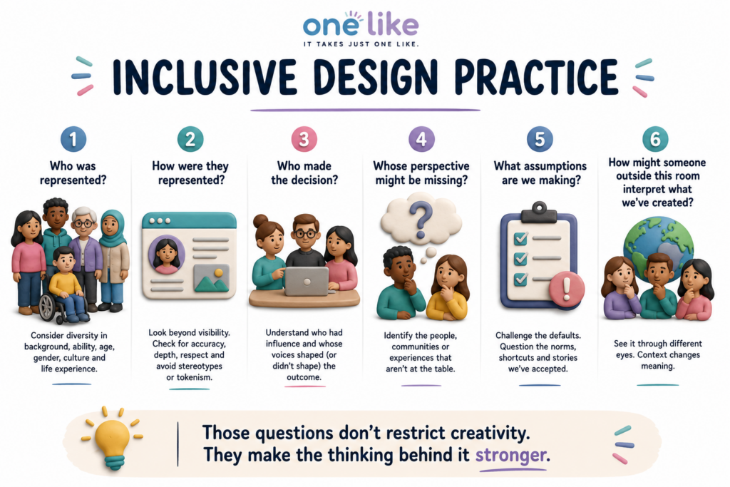
The One Like Design Test!
Before approving a website, campaign, advertisement, product experience or piece of content, run it through the One Like Design Test.
One Like Research & Further Reading
Advertising Regulatory Board (ARB) South Africa — Code of Advertising Practice.
Used for the South African regulatory framework, including advertising standards relating to discrimination, offence, cultural sensitivity and responsibility to consumers.
Mavimbela, M. & Radebe-Nkosi, L. (2025) — Consumers’ Perspectives on Multiracial Advertising in a South African Context, Communitas, Vol. 30, pp. 56–73.
Used for the discussion of multicultural representation, racial connotations, stereotyping, cultural and historical context and South African consumer perceptions.
South African Human Rights Commission (SAHRC) — Clicks/TRESemmé advertising controversy and Inquiry into Discrimination in Advertising.
Used for the South African Clicks/TRESemmé case and the wider discussion of discrimination and representation within South African advertising.
Unilever South Africa — response to the Clicks/TRESemmé advertising controversy, 2020.
Used for the organisational-response discussion, including the subsequent review of marketing materials and imagery following the controversy.
Al Jazeera, NBC News, Global News and Campaign Asia — Qiaobi detergent advertising controversy, China, 2016.
Used for reporting on the Qiaobi advertisement, international reaction, withdrawal of the campaign and the company’s subsequent apology.
Volkswagen Group — Volkswagen Takes Action in Response to Criticism of Social Media Clip, 2020.
Used for the Volkswagen Golf 8 advertising example and the company’s subsequent response, including changes to its approval processes, additional diversity expertise and training.
Microsoft Inclusive Design / Microsoft Garage — Solve for One, Extend to Many.
Used for the inclusive-design principle that designing around people who experience particular barriers can reveal improvements that benefit a much wider group of users.
The Coca-Cola Company — Coke’s Enduring Legacy of Inclusive Advertising.
Used for the discussion of Coca-Cola’s history of inclusive advertising and the 2014 America is Beautiful campaign.
The Coca-Cola Company — America is Beautiful and Coca-Cola is for Everyone, 2014.
Used as supporting primary material for Coca-Cola’s positioning of the campaign around inclusion and representation.
CareerFoundry — What Is Inclusive Design? A Beginner’s Guide.
Used as supporting reading for inclusive-design principles and the distinction between inclusive and universal design.
Lyssna — Inclusive UX Design.
Used as supporting reading for practical inclusive-UX methods, user perspectives and designing experiences for diverse audiences.